
As always, I will start with the original image, I love the composition of a Lonely tree by the lake:

First I will fix the Levels. The first image shows the original levels, the second shows after the adjustments have been made:
1.

2.

Next step is play with Hue/Saturation and Vibrance, in order to achieve better colors, as shown bellow:
1.

2.

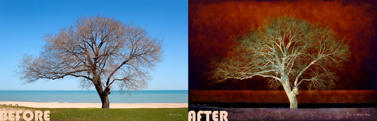
...and here is the final result after all of the corrections have been done:

Now it's time to add some textures. For references on how, and where to find good once visit my previous tutorial
This is the first texture I used with Difference Blending option:

I chose to use that Blending option because I wanted to achieve an abstract color, something that doesn't really exist in the real world, but looks beautiful from a creative point of view. Here is the image after the first texture was applied:

To achieve a higher intensity of the colors and details, I applied a second texture with Linear Burn Blending option and Opacity 59%:

And before I show you the Final result I would like to add another image with the Layer Panel, so you have an idea how every layer was positioned:

...and here you go, the Final look of the Abstract Nature piece:

Thank you very much for stopping by. I hope that tutorial was useful, and please feel free to check back next Friday for more. Have a great day...
Hi Milena.
ReplyDeleteFirst thx for the guide :) Will try this out ^^
Which tool did you use? Seems something like Macintosh?
Regards Silvio
Hi, Silvio
DeleteThanks for stopping by :). Surprisingly, I work with PC. I know that most of the photographers and graphic designers use Mac, but I don't. In my opinion, I could achieve same results with both.
This comment has been removed by a blog administrator.
ReplyDeleteThis comment has been removed by the author.
Delete